shantell: Foreshortened raven staring at viewer with head cocked to the side (Default)
Axial Layouts
Exercise 1: Axial System: Examples.

Exercise 2: Radial Systems: Examples
Nikola Tesla typography poster: Radial posters

Dilatational Systems: Examples


History:

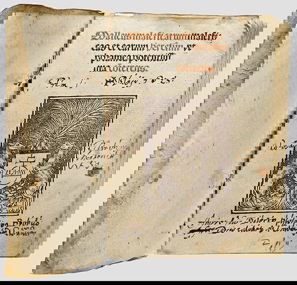
Apollinaire’s Calligrammes (1918): "A book of poetry by French writer Guillaume Apollinaire, noted for its use of “caligrams” in which typeface and arrangement of words on the page add to the meaning of the compositions. In this way, the collection can be seen as a contribution to the tradition of concrete or visual poetry. Considered as the forefather of Surrealism, Apollinaire described his work as follows:"

"The Calligrammes are an idealisation of free verse poetry and typographical precision in an era when typography is reaching a brilliant end to its career, at the dawn of the new means of reproduction that are the cinema and the phonograph. (Guillaume Apollinaire, in a letter to André Billy)"

The Modernist Era: Concrete poetry: "The term was coined in the 1950s. In 1956 an international exhibition of concrete poetry was shown in São Paulo, Brazil, by the group Noigandres (Augusto and Haroldo de Campos, Décio Pignatari and Ronaldo Azeredo) with the poets Ferreira Gullar and Wlademir Dias Pino. Two years later, a Brazilian concrete poetry manifesto was published."
shantell: Foreshortened raven staring at viewer with head cocked to the side (Default)
Sylexiad. A typeface for the adult dyslexic reader: "The investigation concerns a series of typeface legibility and readability studies which have resulted in the creation of a number of new typefaces including Sylexiad. Sylexiad is grounded and informed from a dyslexic viewpoint and is a typeface for the adult dyslexic reader."

Good fonts for dyslexia: "In this paper, we present the first experiment that uses eye-tracking to measure the effect of font type on reading speed. Using a within-subject design, 48 subjects with dyslexia read 12 texts with 12 different fonts. Sans serif, monospaced and roman font styles significantly improved the reading performance over serif, proportional and italic fonts. On the basis of our results, we present a set of more accessible fonts for people with dyslexia."

Special Font For Dyslexia?: "Reading errors like switching letters is a persistent characteristic of errors for
dyslectics (Braams, 2001). This type of error can be explained by the magnocellular theory
(Stein, 2001; Stein, Talcott, & Walsh, 2000). The font “Dyslexie” is developed to increase the
reading accuracy and readability of texts for dyslectics, so that the errors by switching letters
are reduced."

A short introduction to font characteristics: "Serifs make individual characters more distinct. In their sans serif variant many characters look remarkably, if not exactly, like mirror images of each other. During the reading process they are easily confused, especially by persons suffering from dyslexia. The advantage of serifed typefaces over their non serif counter parts, in this respect, is easily seen from the following example:
b d
p q
b d
p q"

Dyslexia, Reading and the Brain: A Sourcebook of Psychological and Biological Research: p. 3: "These were followed in 1900 by a report of “congenital word-blindness” in two boys aged 10 and 11 years (Hinshelwood, 1900) and a further report of four cases from the same family (Hinshelwood, 1907).

In his papers, Hinshelwood referred to previous work by Kussmaul (1877), who apparently coined the term “word-blindness” (wortblindheit) to describe the reading difficulties of previously literate brain-damaged patients. No less a person than the president of the Neurological Society, Sir W.H.(Henry) Broadbent, pointed out (Broadbent, 1896), however, that the condition of word-blindness was not first described by Kussmaul, as might have been inferred from Hinshelwood’s (1895) report. Broadbent (1872) himself had described patients who were unable to read following brain injury, albeit that they also showed some evidence of “verbal aphasia” (p. 150). On the other hand, Broadbent (1896) conceded that it might have been Kussmaul who first described difficulty with reading as “an isolated condition”—that is, as occurring in the context of intact speech (see also Dejerine, 1891, 1892). The word dyslexia was first used (see Hinshelwood, 1896) by a German ophthalmologist, R.Berlin, when referring to reading difficulties caused by cerebral disease or injury (Berlin, 1887).

Inspired by Hinshelwood’s (1895) report, a general practioner in Sussex, W.P.Morgan, wrote to The Lancet giving an account of the reading problems experienced by an apparently normal boy who had suffered no brain damage. Thus it is to Morgan (1896) that we owe the first description in the medical literature of what is now referred to as developmental dyslexia or specific reading disability. His account of what he called “congenital word-blindness” ran as follows:

Percy F.—a well-grown lad, aged 14—is the eldest son of intelligent parents... He has always been a bright and intelligent boy, quick at games, and in no way inferior to others of his age. His greatest difficulty has been—and is now—his inability to learn to read. This inability is so remarkable, and so pronounced, that I have no doubt it is due to some congenital defect...the greatest efforts have been made to teach him to read, but, in spite of this laborious and persistent training, he can only with difficulty spell out words of one syllable... The schoolmaster who has taught him for some years says that he would be the smartest lad in the school if the instruction were entirely oral... His father informs me that the greatest difficulty was found in teaching the boy his letters, and they thought he never would learn them. (Morgan, 1896, p. 1378)
shantell: Foreshortened raven staring at viewer with head cocked to the side (Default)
My next photography assignment is to create a fashion/lifestyle look book. I want to create a look book based upon the fetish community, focusing upon some of the kinks which do not get much representation in the public eye (eg. body piercing, fire cupping, suspension, shibari, pony play) while avoiding some of the more common ones (eg. spanking, blindfolds, light bondage).

The first thing I am doing is researching what goes into making a strong look book. For resources, I've found the following:

How to make a great fashion Lookbook: Touches on context, posing, photo format, image quality, lighting, and detailing.

I found a free template for an InDesign lookbook here: Free InDesign Lookbook Template. This gives me an idea to play around with.

template

I have also put out some feelers to locate people in the BDSM scene who are willing to model for me.

Some of the ideas I'm thinking about showing include:

creative suspension bondage

pony play

Dental spreaders

Penis plugs/sounding

Male submission

Fire cupping

Shibari

Hook suspension

Play piercing
shantell: Foreshortened raven staring at viewer with head cocked to the side (Default)
I'm doing an infographic project for my visual design class, and I've decided to make an infographic based upon the Wilhelm Scream.

I've used several sources to compile my information:


I also installed the Movie Filmstrip font from DaFont.com.


And, in order to create my own data set, I made a very short poll: The Wilhelm Scream Survey with the following question:

Do you notice the Wilhelm Scream in movies?
1. Yes.
2. No.
3. I don't know what that is.

After collecting my data from my various sources, I figured out some statistics and interesting points.

Next, I looked up different sorts of infographics. I went to a blog post called 8 Types of Infographics: Which Is Right For You?. It lists the following infographic types:


  1. Visualized Article
  2. Flowchart
  3. The Timeline
  4. Useful Bait
  5. Versus Inforgraphic
  6. Number Crunch
  7. Photo Infographic
  8. Data Vis


My information could be represented well through Visualized Article, The Timeline, Number Crunch, or Data Vis. I decided to go with Visualized Article as it allows for some writing, and some of the points I wish to share are not numeric.

I found a good article on creating visualized articles at The Do's And Don'ts Of Infographic Design.
shantell: Foreshortened raven staring at viewer with head cocked to the side (Default)
My next photography assignment is to do reflective photography. I found what looks like a good tutorial at Photographing Highly-Reflective Products: How to Control Reflections.

Here's a visual excerpt:

reflection lighting effects

I also found a tutorial on how to use light painting with reflective surfaces, so this appeals to me. How To Take Psychedelic Photos of CDs

Here's one of the CDs photographed using light painting.

light painted cd


Here are some other examples of reflective photography that I found interesting.


shantell: Foreshortened raven staring at viewer with head cocked to the side (Default)
Creating my thumbnails forced me to think further about my logo ideas. I went from full-on monograms to much more abstract designs. My idea changed from octopus to mountains to monograms to variations on the Egyptian fly. I ultimately went with the fly design for a few reasons:

1. It was something I could more easily recreate with my nascent Adobe Illustrator skills.
2. It's loosely based upon a design I created for a tattoo I got.
3. It abstractly incorporates the monogram for SM.
4. It is based off the concept of the Egyptian fly, whose symbolism is meaningful to me.

When I studied jewellery design and jewellery history, I learned about the symbolism of the Egyptian fly.

Necklace from tomb of Queen Ahhotep I

The fly amulet was a military honour bestowed upon those who persevered in the face of adversity. Think about a fly. They never give up. They will keep buzzing around your face no matter how much you bat at them. They are a potent symbol of tenacity, and this is a symbol I found inspiring.

I am not Egyptian, so I chose a species of fly indigenous to where I live: the common greenbottle fly. This species of fly may be found all over the world.
bottle fly

The original concept sketch for my tattoo looks like this:

Tattoo design

The tattoo artist (Cam at Berlin Tattoos) simplified the design to this:

tattoo

I played around with the design some more with the thought of turning it into a logo. The swoop of the wings create an abstract M. Viewed from the side, they also produce an abstract S. And the mouth parts of the fly are a much more direct M.

Here's my initial thumbnail sketch:

Thumbnail sketch

I took it into Adobe Illustrator and worked with shapes, type, and the pen tool. The colours became even more simplified: Chartreuse, mid-toned green, and black. Chartreuse, black, and green are the distinguishing colours of the common greenbottle fly, depending on light refraction. I chose a transparent background so that it could be used digitally on a variety of backgrounds.

I ended up with this:

ShanMonster logo

Then, to see what it looked like in a physical application, I used Photoshop to place it upon an article of clothing.

Bikini bottom

I also rendered the design using traditional media: black and grey ink on paper.

Hand-rendered design

When my software skills are stronger, I'd like to revisit this and improve upon it.
shantell: Foreshortened raven staring at viewer with head cocked to the side (Default)
Light Painting:


Here's a demonstration of how he made the light-painted skeletons.


This light-painted stop motion animation has less focus on the light and more upon what it illuminates.


Ctenophora (Stop Motion Light Painting) from Alex McLaren on Vimeo.


I also love the work being done by Amanda Palmer (and Edward KaSpel).


And I can't talk about stop motion animation without referencing Ray Harryhausen, of course!


And here's a first-person view of diving, which might translate well into stop motion animation.
shantell: Foreshortened raven staring at viewer with head cocked to the side (Default)
I'm looking into representations of owls in stop motion animation and have discovered ookpik stop motion animation movies at Sealskin Stop Motion: Co Hoedeman’s Inuit Legends.

In addition, I found a strange blurb about how the ookpik almost became the national symbol of Canada, rather than the beaver. Ookpik, Little Ookpik but no Song....


I'd like to try making my own impressions of a snowy owl. Here is what one sounds like:

shantell: Foreshortened raven staring at viewer with head cocked to the side (Default)
My next major project has been announced, and I already have ideas on what I want to do.

I was inspired a couple of weeks ago by this video of a snowy owl chilling out on a frozen lake:


I want to do something based upon this idea. I'm tentatively calling it "Ookpik," and would like to have throat singing as background sound, mixed in with the sounds of wind and water. I'd like to incorporate elements of old-timey puppet show/operetta effects. Something along this line:

wave props

But instead of water, I'm thinking of doing water-colour painted blocks of ice, which will be moved up and down.

I'm looking into whether there are owl songs in tradition Inuit throat singing.
shantell: Foreshortened raven staring at viewer with head cocked to the side (Default)
Originally, I'd planned on drawing all of my bats in flight, but after studying each of the species, I decided that focusing upon their faces would be the best idea. The species are most readily distinguished from one another by looking at their faces. From a distance, they look more similar. Also, when I showed my thumbnails to other people in person, the portraits elicited more powerful reaction. People are cuted-out by the faces.

Since part of the reason I chose bats is because they're in trouble because of disease and habitat loss, it makes sense that I should endeavour to make them more appealing to the masses. And so I intend on emphasizing their cute side. People are more likely to want to save things they find cute than things which look gross, no matter how important those gross-looking creatures may be.

So, less this:

Scary bat

And more this:

Big Brown Bat

Here are my thumbnail sketches:

Thumbnails

Thumbnails

Thumbnails

From this, I created six linear sketches.

Silver-haired bat
Silver-Haired Bat

Big Brown Bat
Big Brown Bat

Long-Eared Myotis
Long-Eared Myotis

Little Brown Bat
Little Brown Bat

Red Bat
Red Bat

Hoary Bat
Hoary Bat

Although I'd love to do scientific illustrations for each of these bats, I do not have the time, so instead I plan on doing soft pastel drawings. I want to do the drawings on black paper to make the colours pop, and also to demonstrate the nocturnal nature of the animals.

Here is a colour test of soft pastels on black paper in some of the colours I'll be using.

Pastel colour test

As for the hand-lettering, I plan on using pencil crayon, since pastels are too smudgy.

The stamp booklet will be simple. The background design will be minimal, so as not to detract from the bats. I'm thinking of maybe having a moonlit backdrop.
shantell: Foreshortened raven staring at viewer with head cocked to the side (Default)
My next unit in photography class is based upon product photography, so I went searching for tutorials and some images I find interesting.

product photography

Several useful-looking tutorials are available at Sale as Seen: 44 Tutorials on How to Shoot Perfect Product Photos for Your Online Shop, so I'll be checking these out in greater depth.

Light cube

When I was a student at the New Brunswick College of Craft and Design some fifteen years ago, I did a brief unit on photographing jewellery, but I don't remember a whole lot about it other than it was ridiculously difficult to photograph highly-polished silver. I used some sort of little light cube. And before that, I'd been hired by a jewellery shop to inventory all their merchandise for an online store. There was a light box there, but ironically enough, the highest-quality photos came from me scanning the jewellery with a Kleenex background.

Another idea is to go with light painting, a technique I adore. A tutorial for light-painted product photography is available at Using Light Painting (Lighting Brush) Technique in Product Photography.

This product photo was done with light painting.

light painting
shantell: Foreshortened raven staring at viewer with head cocked to the side (Default)
The advent of the typographic book had enormous repercussions upon the world. It did not take long for the effects to radiate outward from Gutenberg’s presses in Germany. With books dropping significantly in price and increasing drastically in number, illiteracy began to decline. With that decline came a unification and stabilization of languages: a kind of reverse Tower of Babel effect. When people of a nation were suddenly able to communicate with one another through print, it contributed to nationalism and “the development of the modern nation-state” (Meggs & Purvis, 2016, p. 85).

The most popular book of the time was the Bible, the first book committed to Gutenberg’s presses. Edition after edition was printed, putting the Bible in the hand of the common folk. This resulted in people coming up with their own interpretations of the Bible, something which shattered Christianity into hundreds of sects (Meggs & Purvis, 2016, p. 87). Unfortunately, it also acted like gasoline thrown onto the fires of the Spanish Inquisition, which was sworn to fight heretical viewpoints. It was a time of intense religious xenophobia (New World Encyclopedia, 2014, para. 3).

The second-most popular book of the time was a book called the Malleus Maleficarum or Der Hexenhammer in German (“Hammer of Witches”), written by Dominican Inquisitors Heinrich Kramer and Jacob Sprenger. It is unfortunate timing that this book was written so closely after the invention of the printing press. It became a bestseller. With its wide release, the hate-filled misogynistic views of the two Inquisitors spread rapidly across Europe. It became the main handbook for witch hunters between the years of 1486-1600 (Encyclopedia Britannica, 2010, para. 3), resulting in uncountable torturings and excruciating deaths. The influence of the book even made it to the United States years later, informing the views of the Puritans in Salem, Massachusetts, resulting in even more violent deaths.


Malleus Maleficarum

Figure 1. Frontispiece from 1519 edition of Malleus Maleficarum. From LiveAuctioneers (2018).

References


Encyclopedia Britannica. (2010). Malleus Maleficarum. Retrieved February 4, 2018, from https://www.britannica.com/topic/Malleus-maleficarum

N/A (2018). 222: A malleus maleficarum maleficas et earum heresim u. LiveAuctioneers. Retrieved February 4, 2018 from https://www.liveauctioneers.com/item/1299361_222-a-malleus-maleficarum-maleficas-et-earum-heresim-u

Meggs, P. & Purvis, A. (2016). History of Graphic Design (6th Edition). Hoboken, USA: John Wiley & Sons, Inc.

New World Encyclopedia (2014). Malleus Maleficarum. Retrieved February 4, 2018, from http://www.newworldencyclopedia.org/entry/Malleus_Maleficarum


Question

Gutenberg printed from Mainz, and Nuremberg became a major printing centre. Both of these regions were also hot spots for the witch craze during this same period. Do you think this is coincidental? If not, how did one affect the other?
shantell: Foreshortened raven staring at viewer with head cocked to the side (Default)
There is little history to be found online of Leading Tickles, but that does not mean it does not exist. One needs but look at the history of the region to discover some of what happened there. Leading Tickles is nestled in Notre Dame Bay, which was once one of the main areas inhabited by the Beothuk. It seems possible that the Beothuk were the first indigenous North Americans to be encountered by Europeans, well before Christopher Columbus made his murdering way west. When the Vikings sailed west, they encountered folks they called Skraelings. Although it is possible these people may have been Innu or Mi’kmaq, the major Viking settlement, L'Anse Aux Meadows, is in Beothuk territory (Beothuk Language (Beothuck, Skraeling, Red Indian)).

Later on, when other Europeans encountered the migratory Beothuk, they referred to them as “red Indians” because the Beothuk wore furs, hairy side in, with red ochre adorning the outward side (Sketches of Savage Life. No. II.
Shaa-naan-dithit, or the Last of the Boëothics
). They were also said to have worn red ochre or iron-rich soil mixed with fat ( Personal Appearance and Items of Clothing ) on their own skin for springtime celebrations (Beothuk). This may also have been used to repel mosquitos (or “nippers,” as they’re referred to in Newfinese).

This is the 1819 portrait of a Beothuk woman named Demasduit.

Demasduit

Newfoundland was considered a British colony until 1949, and colonial sentiment was still found there when I visited and lived there in the 1970s to early 1980s. I recall seeing homes proudly flying the Union Jack. Indeed, the flag of Newfoundland intentionally incorporates elements of the Union Jack. Compare and contrast the Newfie flag with the British one to see for yourself.

Union Jack

Newfoundland flag

Leading Tickles is situated along “Iceberg Alley” and is known for its magnificent views of icebergs in the springtime. It also boasts a lovely walking trail at Ocean View Park.

From my research, I gleaned elements to be represented in the flag to be:

  • Beothuk history
  • British colonialism
  • Springtime
  • Icebergs
  • Hiking


The colours for the flag I designed incorporate each of these elements. The red, white, and blue are the same basic colours used in the Union Jack, showing the colonial history, however, the strong horizontal line of red demarcates the break with Great Britain. It also memorializes the Beothuk, for whom the colour red was so important. The iceberg motif is edged in red, symbolizing the Oceanside Trail, and also the ancestral migratory routes of the Beothuk. The blue also has the obvious connotation of sky and sea, and the white the colour of ice.

The iceberg motif is situated on the leftmost side of the flag. This is so the elements are still visible, even if the flag is hanging down on a windless day.

Leading Tickles flag
shantell: Foreshortened raven staring at viewer with head cocked to the side (Default)
Johann Gutenberg’s Forty-two-line Bible, also known as the Gutenberg Bible or the Mazarin Bible (Encyclopedia Britannica, 2016, para. 1), is the first typographic book. A large book (30 x 40.5 cm pages), it is laid out in two columns of justified type with a 2.9 cm margin dividing them. The first nine pages of the book contain forty lines per column, and the tenth contains forty-one. The remainder of the 1,282-page volume is set with forty-two lines per column, hence the name of the book. With an average of 33 characters per line, “each page had over 2,500 characters set from a fond of 290 different characters” (Meggs & Purvis, 2016, p. 80).

Because so many different characters were used, with a variety of ligatures, the book achieved the same sort of variety and richness seen in the illuminated manuscripts which inspired it. Indeed, illuminated text and illustrations remained part of the book in spite of the use of moveable type. Blank spaces were left in order for decorative capital letters to be hand-drawn by scribes. Originally, Johannes Gutenberg wished to print the book in two colours, but this proved too difficult at the time. Instead, illuminators added illustrations and red text, initials, and headers (Meggs & Purvis, 2016, p. 80).

References


Encyclopedia Britannica. (2016). Gutenberg Bible. Retrieved January 28, 2018, from https://www.britannica.com/topic/Gutenberg-Bible

Meggs, P. & Purvis, A. (2016). History of Graphic Design (6th Edition). Hoboken, USA: John Wiley & Sons, Inc.

Question


I’ve long been intrigued by marginalia (images, notes, and doodlings in the margins), and marginalia was used in both illuminated manuscripts and the Gutenberg Bible. Some examples may be found for illuminated manuscripts here (https://io9.gizmodo.com/5896008/medieval-monks-complained-about-their-jobs-in-the-margins-of-ancient-manuscripts ) and for the Forty-two-line Bible here (http://www.hrc.utexas.edu/exhibitions/permanent/gutenbergbible/ransomcenter/). Why do you suppose marginalia is not discussed in the Meggs & Purvis text when it was a ubiquitous form of textual/graphic communication in books of the time?
shantell: Foreshortened raven staring at viewer with head cocked to the side (Default)
Broadway and Thorne’s Fat Face are typefaces with a long and illustrious history. Thorne’s Fat Face is the older of the two typefaces, dating back to the dawn of the nineteenth century. Its creator, Robert Thorne, was a pioneer of typography and a prominent type founder. With the advent of readily-available printing technology, there was a huge rush in print advertising. Thorne’s business was thriving under this demand, and he developed this extra-bold typeface, which was described as “fat”, in 1803.

Thorne’s Fat Face was a sensation. It was sought after by advertisers because its engorged letterforms paired with hair-thin serifs and connecting strokes made it dominate a page (Kennard, 2014, para. 1). It was well-suited for ornamentation because of its thick letters, as can be seen in this reward poster for a missing horse.

lost horse

Although it was much sought-after by advertisers, critics were aghast. One referred to it as having “preposterous disproportions” (de Jong et al, 2017, p. 108) Despite the criticisms, it was a successful typeface, and ended up having a significant effect on how text was used in advertising.

Before the advent of fat typefaces, advertisements were wordy, with long narratives. Since there was no room for many words on a poster dominated by Thorne’s Fat Face, advertising evolved to use fewer words, and to be punchier and more concise (de Jong et al, 2017, p. 109).

Compare the verbosity of the preceding poster with this poster from the 17th century:

Wall of text advertisement

Thorne’s Fat Face made advertising quickly readable without anyone needing to squint.

The next typeface to be compared, Broadway, was and is used for other purposes altogether. Superficially, they seem quite different. Thorne’s Fat Face is turgid and bloated, especially paired with its miniscule serifs. However, Broadway is not entirely dissimilar despite its more elegant appearance. It also relies on the pairing of thick strokes with thin ones, but to a different effect.

Broadway was designed in 1927 by Morris Fuller Benton. Originally, it was created with only uppercase letterforms, but lowercase letterforms were developed in 1929 by Sol Hess (P22 Type Foundry, 2018, para. 1). Unlike Thorne’s Fat Face, Broadway is a decorative sans serif typeface, and where Fat Face evokes a feeling of snake oil salesmen and wanted posters, Broadway is the textual embodiment of the Roaring Twenties. It is the quintessential Art Deco typeface, as can be seen in this poster:

Art Deco

It was also used for its namesake as evinced by this original cast recording for the production of Bullets Over Broadway:

Bullets over Broadway

The Broadway typeface contains no descenders in its lowercase letterforms which makes it ideal for bold underlining. Its angular tangents between thick and thin also give it high contrast, making it ideal for colourful compositions (Microsoft, 2018, para. 1).

Both typefaces have a distinct appearance, and both effectively take viewers back to the times in which the letterforms were created.


And here is my study of the two typefaces, hand-drawn on fondant-covered cookies.

Eat my words

References


De Jong, C., Purvis, A., & Tholenaar, J. (Eds.) (2017). Type: A Visual History of Typefaces & Graphic Styles. Cologne, Germany: Taschen.

Kennard, J. (2014, February 6). The Story of Our Friend, the Fat Face [Blog post]. Retrieved January 24, 2018 from https://fontsinuse.com/uses/5578/the-story-of-our-friend-the-fat-face

Microsoft (2018). Microsoft Typography: Broadway. Retrieved January 24, 2018 from https://www.microsoft.com/typography/fonts/family.aspx?FID=86

P22 Type Foundry (2018). Broadway. Retrieved January 24, 2018 from https://p22.com/family-Broadway
shantell: Foreshortened raven staring at viewer with head cocked to the side (Default)
Dave McKean is a British illustrator, designer, photographer, filmmaker, comic book artist, and more. He lives in Maidenhead, Berkshire, England. His work is often experimental, and he has used unorthodox methods to create art. As an example, he experimented with colour copying machines, shining lights on them, and scanning his own beard to achieve different visual effects. He originally wanted to illustrate record covers, but entered the field as CDs were taking over as the main music medium. He also wanted to be a comic book illustrator, and this dream came true in a big way.

When he was in his final year of art school and still unknown, he met up with writer Neil Gaiman and in 1987, they created a graphic novel called Violent Cases.

[Violent Cases]

It was the beginning of a long and productive relationship. Gaiman and McKean enjoyed working together very much, and they were given the opportunity to collaborate further. McKean’s distinct illustration style, drawing upon such elements as painting, collage, photography, drawing, set construction, and more, became the face of the award-winning Sandman series written by Gaiman. Sandman ran regularly from 1989 to 1996 and reappeared as Sandman Overture in 2016.

Sandman

McKean and Gaiman have collaborated many times since they first met on a variety of projects. This is one of McKean’s illustrations for Gaiman’s Signal to Noise graphic novel.

Signal to Noise

Text is incorporated as much as an illustrative technique as it is for a storytelling technique.
Another example of his incorporation of text into illustration is seen on this Sandman cover illustration:

[Sandman cover]

Another example of this use of words for visual impact is seen in this portrait of Gaiman.

[Neil Gaiman]

McKean has collaborated with other creators over the years, and has also done solo projects. His most recent book is Black Dog: The Dreams of Paul Nash. He wrote and illustrated this tale of WWI surrealist artist Paul Nash.

Black Dog

He is sought after for his album cover art, editorial illustrations, and more. McKean has also worked with chef Heston Blumenthal, evolutionary biologist Richard Dawkins, and authors Ray Bradbury and Stephen King.

Here is an editorial illustration about Surveillance for Security Management Magazine in 1996:

Surveillance

He has created album covers for Tori Amos, Skinny Puppy, Frontline Assembly, Toad the Wet Sprocket, Machinehead, Fear Factory, Alice Cooper, and many more.

Here is the cover for Skinny Puppy’s BRAP album:

[BRAP]

His biggest achievement to date has been the monumental project Arkham Asylum: A Serious House on Serious Earth, a Batman graphic novel. For this book, he produced 120 pages of paintings which reinterpret the classic characters of DC’s Batman universe. Almost 200,000 copies of the hardcover have been sold, and almost 100,000 of the trade paperback.
Here is a page from this book:

Arkham Asylum

He illustrated Gaiman’s children’s book The Wolves in the Walls which went on to win the NY Times Illustrated Book of the Year award.

[Wolves in the Walls]

McKean’s illustrations cross over into film, as well. In 2005, he collaborated with Gaiman and the Jim Henson Company to create Mirrormask. This is a still from the movie:

[Mirrormask]

In addition, he has done concept illustration for the Harry Potter series and collaborated with Lars von Trier’s interactive House of Zoon project in Copenhagen.

As an illustrator, he is successful because his illustrations are evocative and full of story while also being revolutionary because of his eagerness to experiment.

Bibliography:

https://arinagablog.wordpress.com/2016/03/09/dave-mckean/
http://thequietus.com/articles/17626-dave-mckean-interview
http://neilgaiman.com/Cool_Stuff/Essays/Essays_By_Neil/Neil_Gaiman_on_Dave_McKean
http://www.gaimanmckeanbooks.co.uk/
http://www.davemckean.com/

Here is my own illustration for Alice in Wonderland inspired by his illustration work. It is a mixed media piece done with collage, acrylic, gesso, ink, and soft pastels on pastel paper.

[Jackass]
shantell: Foreshortened raven staring at viewer with head cocked to the side (Default)
The Story of Our Friend, the Fat Face
Robert Thorne's Fat Face


Wall of text advertisement


Broadway™
Broadway: Microsoft Typography: "First released in 1929, Broadway exudes the atmosphere of the Roaring Twenties. Thick black strokes on the left half of characters such as the 'B' and 'O' make the letterforms abstract and ornamental. Where thick and thin strokes meet, the letterforms feature angles rather than curves, similar to the way Art Deco treats natural forms. Broadway is ideal for the design of decorative posters and display material. With no descenders in the lowercase letterforms, Broadway accepts bold underlining without the usual trouble of disappearing descenders. In addition, due to its high contrast, Broadway remains visible on backgrounds of similar density, making it ideal for colorful work. For example, green lettering on a blue background would be difficult to read if the font were Arial, but the same colors would be easier to read with the text in Broadway."

FONT DESIGNER – MORRIS FULLER BENTON

Bullets over Broadway

Art Deco
shantell: Foreshortened raven staring at viewer with head cocked to the side (Default)
I'm to design a flag for a Canadian municipality. Springhill, NS, comes to mind. It's my mother's hometown, and I spent a fair amount of time there in my childhood. It's an inland town known for its once thriving coal-mining industry, and for three coal mining disasters. Nowadays, it hosts a penitentiary.

.... aaaaand I just found out it stopped being a municipality three years ago and no longer qualifies for my project. Back to the drawing board....

Next up is Nackawic, NB, which is a municipality (I checked). I went to high school there. The town came to be when surrounding areas were flooded because of construction of the Mactaquac Dam. People resettled at what became Nackawic (previously named Otis). Sadly, its crowning attraction is that it is home to the world's biggest axe. The axe is in recognition of the forestry industry. Alas, but the pulp and paper mill went bankrupt and hundreds of residents lost their job, so the big axe took on a whole new meaning, going from noun to verb.

Important elements for Nackawic are the river and the forest, so the colours green and blue immediately come to mind, along with an axe motif.

I looked up Dildo, NL (because hahahah, and also because I used to swim there when I was little), but it is not a municipality.

Then I found Leading Tickles in a list of Newfoundland municipalities. I love the name of the place, although I don't think I ever went there despite living in the general vicinity and probably having lots of distant relatives there. The Facebook page for the community has a delightful bit of Newfinese in the about page: "This page be about events that's taken place and many photos of Leading Tickles." Leading Tickles is a rocky forested harbour village on the northern coast of Newfoundland. It has a park and hiking trails, and its claim to fame is the plethora of springtime icebergs. The federal government is represented in the town with the Harbour Authority of Leading Tickles.

Blue and white are representative of the icebergs and harbour.

I sent a message to the folks at the FB page requesting more information. Here's hoping they get back to me!

[Iceberg and dory]

Leading Tickles is on Notre Dame Bay, which was once the home of the Beothuk people. Red ochre was used by the Beothuk in their spring celebrations. Including an ochre red would memorialize these people wiped out through genocide.

I think a flag representing Leading Tickles would best be represented by blue, white, and red. Red, white, and blue are also the colours of the Union Jack. Newfoundland was a British colony until 1949, so these colours hearken back to this part of its history. Since the symbolism of the Beothuk red and the iceberg blue and white are both representative of springtime, they also become colours of springtime rebirth and regeneration.

Here's some additional information on flag placement policies in Canada: Flying Rules

Profile

shantell: Foreshortened raven staring at viewer with head cocked to the side (Default)
Shantell Powell

April 2018

S M T W T F S
1 234 567
8910 11 121314
15161718192021
22232425262728
2930     

Syndicate

RSS Atom

Most Popular Tags

Style Credit

Expand Cut Tags

No cut tags
Page generated Apr. 16th, 2026 04:15 pm
Powered by Dreamwidth Studios