shantell: Foreshortened raven staring at viewer with head cocked to the side (Default)
Light Painting:


Here's a demonstration of how he made the light-painted skeletons.


This light-painted stop motion animation has less focus on the light and more upon what it illuminates.


Ctenophora (Stop Motion Light Painting) from Alex McLaren on Vimeo.


I also love the work being done by Amanda Palmer (and Edward KaSpel).


And I can't talk about stop motion animation without referencing Ray Harryhausen, of course!


And here's a first-person view of diving, which might translate well into stop motion animation.
shantell: Foreshortened raven staring at viewer with head cocked to the side (Default)
The binding method I used for my pop-up book is the single sheet binding method. This method allows the book to lie flat without any need of scoring the pages. It is well-suited to thick pages, which is the case for this book with its pages of illustration board. It also gives an interesting look to the spine of the book.


In order to do this, I had to locate six curved needles. I couldn’t find packs of just curved needles, so I had to buy multi-packs of assorted needles. I now I have more tapestry, carpeting, darning, etc. needles than I will ever need. I purchased a heavy-duty awl to make the holes for each stitch.

I used grey embroidery floss for the binding. Grey was chosen because it is neutral and doesn’t distract from the colour scheme of the book.

shantell: Foreshortened raven staring at viewer with head cocked to the side (Default)
My original plan for binding the book was to use a style which left the stitching visible. However, I had a difficult time finding the right tutorial. I eventually found a tutorial for single sheet bookbinding and did a mock-up.

I had to purchase a few supplies first of all. I needed six curved embroidery needles, red embroidery floss, and an awl. I also had to drink a couple of glasses of wine. Why? Because I needed a cork to safely store my awl, and waste not, want not, right?

I also had to practice making a leather-bound book cover. My first step was to measure and cut a piece of thick card stock. I chose a comic back board. I then cut a piece of leather with ~3/4" border all around. I used rubber cement to bond the leather to the board.

making a cover

I next put rubber cement over the other side of the comic back board, waited for that to dry, and carefully folded down the leather.

cover in progress

I then went to the corners and added more rubber cement to affix them in place.

The leather side of the cover was done, but I still needed to finish the reverse side.

leather cover

Next I cut a piece of lining paper slightly smaller than the comic back board to cement on top of it all. It was done. The next part was to prepare a template for the single sheet binding, and make corresponding holes in the cover with my awl.

with lining paper

Happy with how my mock-up turned out, I repeated the process with the leather for the Skinfolk book, careful to line up the beadwork just right. It's especially important to affix the beaded leather in place. If the leather had not been cemented into place, the threads holding the beads in place could eventually fray from the friction of rubbing.

skinfolk cover

skinfolk rear view of covers

As for the binding technique, I first practiced on regular printer paper and used sewing thread. It soon became obvious that sewing thread was far too thin, so I cut it all out and started over with heavy cotton thread: the sort I use for weaving. This thickness was good, but the paper was too thin, and was getting torn by the binding style. There are two fixes for this which are incorporated into the final book. The pages will be printed on heavier paper, and the binding margins are reinforced with tape. This will extend the life of the book.

The single sheet binding tutorial was posted by Sea Lemon on YouTube.


The entire process of preparing the cover and binding the book is time-consuming, but not difficult. Preparing the covers, with all the cutting, waiting for rubber cement to dry, etc., took several hours.
shantell: Foreshortened raven staring at viewer with head cocked to the side (Default)
Several photos needed to be taken for Skinfolk. There are four photo pages in total, but since some of those pages are composites, I needed to set up at least twice as many photo shoots as I had pages.

All photos were taken in my home studio, which does not have studio lighting or proper backdrops (yet). When I couldn't use natural light, I used a halogen torch lamp shining off the ceiling for a flood fill. After photos were taken, I cropped extraneous details out of the back (I have a very narrow shooting area) and then changed everything to greyscale.

The first photograph is for Tuglik & Qujapik. I needed, and found, a model who could play a powerful grandmother. I took several photographs, some with a strap-on dildo, and some without. This is the photo I chose. The ones with the strap-on looked too modern for my liking. The model wished to remain anonymous, so her face is obscured by her hair which adds a witchy feel.

[Tuglik & Qujapik]

For the story of Kiviuq & The Spider Woman, I originally had planned on photographing a model who has extensive scarification in the form of spider webs. However, I was unable to work out a location and time for the shoot, and went with another model and a slightly different idea. Trish Sweet was an excellent model and after we conferred, she designed her own body makeup. She wore one of my wigs and we used a fake fur blanket. We tried a few different poses, including ones where she looks like she's slicing off one of her eyelids, but in the end I went with this shot because this portrayal of the Spider Woman is powerful and has a regal bearing.

Since the model had also shaved her eyebrows off in advance, I chose to make a small adjustment to the story. In some versions of the Kiviuq & the Spider Woman story, the Spider Woman cuts off her eyebrows rather than her eyelids. This version matches up perfectly with the model.

Spider Woman

For the story of Blubber Boy, I needed to make a composite photo. First, I set up a shoot with myself as the background model. This was straightforward. For the next shoot, I wanted and found a masculine model with a slim to muscular build, not too tall, with no visible body art. My first photos of him were straightforward rear views. Then I applied KY Jelly all over his back and legs and photographed him this way. I ultimately chose a shot of him with the jelly. I then printed a 12x17 shot of my crotch, and a 8.5x11 shot of Blubber Boy. I cut out the Blubber Boy photo, overlaid it onto the 12x17, then dolloped hand sanitizer gel all over the bodies. I photographed this composite and put it back into grey scale.

Blubber Boy

For Sun Woman and Moon Man, I took several photographs of multiple models, including myself. I do not have access to traditional ulus or ivory forks, so I found images of both and printed them out life-sized. I then cut them out for use as props. Both the feminine models used the ulu for the crotch-cutting shots, and everyone used the ivory fork for the butt-stabbing shots. After each photo was taken, they were printed, cut out, and placed onto a dark background and rephotographed. This photo was then put into greyscale.

Sun Woman and Moon Man
shantell: Foreshortened raven staring at viewer with head cocked to the side (Default)
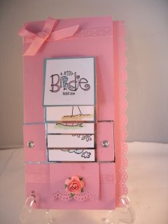
Waterfall Card Tutorial: Although she uses specialized scrapbooking tools in the video, the project is easily adapted to more basic crafting supplies.

waterfall card


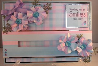
Penny Slider Tutorial

pennyroller


shantell: Foreshortened raven staring at viewer with head cocked to the side (Default)
Part of the project involves a hand-lettered book cover. I knew I wanted to do something with the Arjowiggins Inuit typeface, but as a bespoke typeface, it is not commercially available. I wrote to Arjowiggins Creative Papers, and they were nice enough to share it with me for my project.

At first, I was planning on replicating the typeface with tech pen, but while talking to folks at the Aboriginal Services Centre at Conestoga College, I saw Christina Restoule doing traditional indigenous beadwork. I asked Tauni Sheldon, an Inuk elder, if the beadwork was also used by Inuit, and she said that yes, it is a common element used on parkas and such. And so I decided I wanted to do my lettering in traditional beadwork.

Ms. Restoule told me she'd get me started with the technique, and on Friday, December 15, she helped me find the right sized beads and some leather to work with. I used an actual-sized printout of the title as a template.

The process is time-consuming. I worked on the beading all afternoon and into the late evening on Friday, throughout the day on Saturday and Sunday, then picked the template out painstakingly on Monday before adding the final accent red bead in the tittle.

I chose black leather to contrast with white and sparkly blue glass beads. The single red bead represents blood.

beginning lettering

adding blue borders

beading completed
shantell: Foreshortened raven staring at viewer with head cocked to the side (Default)
My next design project is for a pop-up book. Instead of working with paper, I think I'd like to work with fabric. I'd like to make an interactive sewn book.

Here are a few links with ideas.

Nora's Homemade Cloth Activity Book

How to make your own archival book cloth

Your Beginner's Guide to Making Pop-Up Books and Cards

33 DIY Ideas For Making Pop-Up Cards

How to make simple kirigami craft for kids
shantell: Foreshortened raven staring at viewer with head cocked to the side (Default)
I put out a call for models and had several volunteers. I did most initial photography in my studio. Since I do not have studio lighting, I used a floor lamp projected at the ceiling for a fill light. For the remainder of the photography, I travelled to Toronto and shot the photos in the models' homes the best ambient lighting I could achieve with what was present. I used digital photography since I do not have access to a dark room. Coloured photos were switched to black and white and were cropped, but aside from this, there was no digital manipulation done to any of the photos. All effects were done manually.

My photos and their manipulations were inspired by Kansuke Yamamoto's Stapled Flesh.


Further to the theme of a survey of surrealism, I also incorporated motifs used by other artists. Pins, chains, insect parts, etc. are incorporated by a variety of surrealists. I wanted to demonstrate the inclusivity of the surrealist movement, which was international in scope, and which included males, females, and agenders/transgenders. My models are a variety of genders, nationalities, and body types.

Here are my variations.

1.
Sewn Flesh. Black and white photo with embroidery floss. In order to sew this, I marked out stitch points on the photo, placed the photo on a corrugated cardboard backing, and carefully punched the holes with a thick needle. When the holes had been made, I sewed carefully with thread, being sure not to crease the paper.

2.
Wired Flesh. Black and white photo with partially melted sterling silver wire. I lightly melted the ends of the sterling silver wire with an acetylene torch and placed them on top of the photograph.

3.
Sewn Flesh. Black and white photo with cotton thread. In order to sew this, I marked out stitch points on the photo, placed the photo on a corrugated cardboard backing, and carefully punched the holes with a thick needle. When the holes had been made, I sewed carefully with thread, being sure not to crease the paper.

4.
Pinned Flesh. Black and white photo with straight pins. I first placed the photograph onto thick corrugated cardboard, then stuck it with straight pins at regular intervals.

5.
Wire Sewn Flesh. Black and white photo with copper wire. In order to sew this, I marked out stitch points on the photo, placed the photo on a corrugated cardboard backing, and carefully punched the holes with a thick needle. When the holes had been made, I carefully threaded the wire through by hand, and bent the wire into place by hand. This was the most difficult piece to do without creasing the photograph, and the nature of the media/tools made even stitch shapes impossible. The idiosyncrasies of the wire make for an interesting contrast with the regularity of the other photos.

6.
Metal Flesh. Black and white photo with copper and brass findings forged and soldered by me. The metal pieces were placed on top of the photograph.

7.
Chained Flesh. Black and white photo with machine-made chain. The chain was placed on top of the photograph in such a way as to match up with and continue the line of the model's tattoo.

8.
Tacked Flesh. Black and white photo with thumbtacks. The photograph was placed onto thick corrugated cardboard and then stuck with thumbtacks at a regular interval. I think this photograph is especially evocative with anguish/pain. The model was unable to get into a low kneeling body posture because of their physical constraints, and the pins accentuate this discomfort.

9.
Winged Flesh. Black and white photo with Morpho menelaus wings. Butterfly wings were placed onto the photograph.

10.
Winged Flesh. Black and white photo with butterfly wings. Butterfly wings were placed onto the photograph.

11.
Winged Flesh. Black and white photo with butterfly wings. Butterfly wings were placed onto the photograph.
shantell: Foreshortened raven staring at viewer with head cocked to the side (Default)
In order to continue with the survey of surrealism, I'm experimenting with various surrealist techniques in conjunction with the Josef Albers interaction of colour. I already used decalcomania for one layer. I continued with that theme in a separate colour for another layer, and then added a new technique: automatic writing, or psychic automatism. This technique was used by Andre Masson.


André Masson began automatic drawings with no preconceived subject or composition in mind. Like a medium channeling a spirit, he let his pen travel rapidly across the paper without conscious control. He soon found hints of images—fragmented bodies and objects—emerging from the abstract, lacelike web of pen marks. At times Masson elaborated on these with conscious changes or additions, but he left the traces of the rapidly drawn ink mostly intact (from MOMA's page on Andre Masson and Automatic Writing)


I used this technique three times: twice on layers of decalcomania, and once on a sheet of green transparent plastic.

Here are the results, overlaid onto white paper for better contrast.


I also incorporated part of an x-ray to continue the theme of "Body of Work" and to make allusion to the often x-ray-like work of Man Ray.


When placed together, this is how they interact.

shantell: Foreshortened raven staring at viewer with head cocked to the side (Default)
I am to research an art period/movement and implement it in a large design project. At first, I thought I'd do my project on surrealism, but then I thought it might be interesting to do it on an art style which isn't typically approached for this sort of project. I considered Inuit art and naive art, but unfortunately had to discard them as typography and/or photography wasn't sufficiently represented in these styles. And so I've come back to surrealism, which has a rich history with many colourful characters encompassing all sorts of design media.

Aside from research online, I've visited several libraries and spoke to librarians. I was introduced to the database system used by the Kitchener Public Library system, and found out I should be able to qualify for a community library card at Wilfrid Laurier University, thus giving me access to university libraries (and interlibrary loans).

I also went to the AGO twice to study the surrealist works at the Guillermo del Toro exhibit. I did several drawings of works there and took many photographs, including close-ups of various details.

Research resources:
The History of Visual Communication: The New York school included surrealists.
A Dictionary of Surrealism and the Graphic Image
Manifesto of Surrealism, by André Breton
Japanese surrealism
List of surrealist artists
Surrealist Artists: List of Painters, Sculptors, Photographers Associated with Surrealism.
Surrealism and the Occult
Drawing Surrealism
Decalcomania
SPECIAL SECTION ON NATIVE AMERICAN SURREALISMS, GUEST EDITED BY W. JACKSON RUSHING III


Typographers and Typography:
Normality Tinged With Perversion: David Lynch's Use of Typography
Isidore Isou - founded Lettrism
Diter Rot - Diter Rot Copley Book, Letterpress text
Elaine Lustig Cohen
Roman Cieslewicz: Typographer for The Mysteries of France:
A Gothic Guidebook
. A copy of the book is at the Kingston Queens University Library.
Eugen Gomringer
Oyvind Fahlstrom
Zdanevich
The Visible Word: Experimental Typography and Modern Art, 1909-1923 By Johanna Drucker
Salvador Dali made a few letters for his Paule Gala alphabet. More at Erotype.
The Art of Graphic Design: Lustig, Albers, Johnson, and the 1945 Summer Session by Julie J. Thomson
Edward Fella: Letters on America
Joop H. Moesman: Petronius
Typophile forum
The Man Who Married Text and Art: Isidore Goldstein and Lettrism


Colour Theory:

Josef Albers and Colour

Artists:

H R Giger Illustrations: includes early works from the 60s and 70s
Kansuke Yamamoto
Alejandro Jodorowsky
Jopie of Joop
Jindřich Heisler: Surrealism under Pressure
Wilfredo Lam: Cuba's last of the true surrealists

Techniques:

Decalcomania tutorial
Accordion book tutorial
Cubomania: Gherasim Luca and Non-Oedipal Collage by Krzysztof Fijalkowski at Norwich University of the Arts
Surrealist techniques

Profile

shantell: Foreshortened raven staring at viewer with head cocked to the side (Default)
Shantell Powell

April 2018

S M T W T F S
1 234 567
8910 11 121314
15161718192021
22232425262728
2930     

Syndicate

RSS Atom

Most Popular Tags

Style Credit

Expand Cut Tags

No cut tags
Page generated Jul. 12th, 2025 05:25 am
Powered by Dreamwidth Studios