shantell: Foreshortened raven staring at viewer with head cocked to the side (Default)
The scratch mark photo shoot was one which incorporated both the model's skin and its relation to her metal-tipped flogger. The photo I chose for this composition was a simple one, showing the marks on her back. Lighting was afternoon sunlight, and I stood overhead, shooting directly down for this shot:

Scratched back

My first idea was to create a photo montage with the model's skin providing a backdrop (no pun intended) to her portrait.

Portrait

I ultimately chose against this idea and decided to instead do a bodyscape. I rotated the image and cropped it, leaving the model's waist contrasted against the blanket she was lying on. Then, in order to make the photo match the rest of the editorial spread, I played with curves in Photoshop to shift and distort the colours. The texture of the blanket was too distracting, so I used a smudge tool to change its texture.

The end result is a graphic bodyscape/skyscape/landscape image.

Bodyscape
shantell: Foreshortened raven staring at viewer with head cocked to the side (Default)
I'm thinking of calling my collection "Graphic Content" on account of the colour treatments paired with the subject matter. I'm gradually learning my way around Photoshop and have been playing with curves and colour balance in order to distort my images and make them much more graphic and high-contrast.

Here's a detail shot I took during a fire play session. Lighting was a bit tricky. I had a blue LED overhead, and the light from the fire itself. I turned off my white LED rim lighting for this one. I had to take photos in bursts because of the nature of the shoot. Fire doesn't pose, and it doesn't want to stay in frame. In addition, the fire top's hands were moving quickly, and it was difficult to obtain a clear photo without a lot of blur.

Here's my original, unedited image.

Fire Wand

I cropped the image in order to tighten up the composition. The position of the leg/flame and the arm create an intersection at the centre of the image, directing the eye to the action. The focal point is the tip of the fire wand, which, in turn, directs the eye toward the fire cup.

I used curves to create colour distortion and increase the contrast. The colour treatment and contrast makes it connect with the other photos in the series, even though the colour palette is different.

Here's what I came up with:

Fire Cups and Wand

This is closer to what I want, but not quite there, so I repeated the process, tinkering a bit with hue balance.

Fire wand drama
shantell: Foreshortened raven staring at viewer with head cocked to the side (Default)
I set up a photoshoot with a play piercing top (Voralis) and bottom (Kai) in Toronto. The plan was to photograph a piercing session in which Voralis would be using shark hooks on Kai's back. The photos were taken in their dungeon, and for lighting, I had coloured LEDs and my portable LED light table. The background was a neutral grey wall. I ended up taking approximately 150 photos during the session.

The room is small, and the ceiling is low, so it was tricky to find good angles with uncluttered backgrounds, so I did the best that I could manage. It was difficult to be far enough back to get full scenes in frame, so for the most part, I did tight shots.

The first photo I chose to work with from the shoot is a portrait in which Kai has ribbons attached to the piercings. The ribbons are attached to a ceiling rig, applying tension to the skin. The light at this time was blue LED with rim lighting and backlighting on the wall done with the portable light table.

Here is the unedited shot:

[Hook piercing unedited]

The preview on my camera showed this in finer detail than it came out as on my computer. In this image, the backlit wall is blown out, and the details on the face are too dark. The architecture of the room is distracting, as well. I played around a bit with Photoshop to see what I could do to correct this. I cropped the image, then used the clone stamp tool to remove the distracting background lines as well as the piercer. Then I started playing with curves on Photoshop to adjust the colour balance and to play with distortion and graininess.

Here is what I came up with:

[Portrait of Kai]
shantell: Foreshortened raven staring at viewer with head cocked to the side (Default)
Axial Layouts
Exercise 1: Axial System: Examples.

Exercise 2: Radial Systems: Examples
Nikola Tesla typography poster: Radial posters

Dilatational Systems: Examples


History:

Apollinaire’s Calligrammes (1918): "A book of poetry by French writer Guillaume Apollinaire, noted for its use of “caligrams” in which typeface and arrangement of words on the page add to the meaning of the compositions. In this way, the collection can be seen as a contribution to the tradition of concrete or visual poetry. Considered as the forefather of Surrealism, Apollinaire described his work as follows:"

"The Calligrammes are an idealisation of free verse poetry and typographical precision in an era when typography is reaching a brilliant end to its career, at the dawn of the new means of reproduction that are the cinema and the phonograph. (Guillaume Apollinaire, in a letter to André Billy)"

The Modernist Era: Concrete poetry: "The term was coined in the 1950s. In 1956 an international exhibition of concrete poetry was shown in São Paulo, Brazil, by the group Noigandres (Augusto and Haroldo de Campos, Décio Pignatari and Ronaldo Azeredo) with the poets Ferreira Gullar and Wlademir Dias Pino. Two years later, a Brazilian concrete poetry manifesto was published."
shantell: Foreshortened raven staring at viewer with head cocked to the side (Default)
Sylexiad. A typeface for the adult dyslexic reader: "The investigation concerns a series of typeface legibility and readability studies which have resulted in the creation of a number of new typefaces including Sylexiad. Sylexiad is grounded and informed from a dyslexic viewpoint and is a typeface for the adult dyslexic reader."

Good fonts for dyslexia: "In this paper, we present the first experiment that uses eye-tracking to measure the effect of font type on reading speed. Using a within-subject design, 48 subjects with dyslexia read 12 texts with 12 different fonts. Sans serif, monospaced and roman font styles significantly improved the reading performance over serif, proportional and italic fonts. On the basis of our results, we present a set of more accessible fonts for people with dyslexia."

Special Font For Dyslexia?: "Reading errors like switching letters is a persistent characteristic of errors for
dyslectics (Braams, 2001). This type of error can be explained by the magnocellular theory
(Stein, 2001; Stein, Talcott, & Walsh, 2000). The font “Dyslexie” is developed to increase the
reading accuracy and readability of texts for dyslectics, so that the errors by switching letters
are reduced."

A short introduction to font characteristics: "Serifs make individual characters more distinct. In their sans serif variant many characters look remarkably, if not exactly, like mirror images of each other. During the reading process they are easily confused, especially by persons suffering from dyslexia. The advantage of serifed typefaces over their non serif counter parts, in this respect, is easily seen from the following example:
b d
p q
b d
p q"

Dyslexia, Reading and the Brain: A Sourcebook of Psychological and Biological Research: p. 3: "These were followed in 1900 by a report of “congenital word-blindness” in two boys aged 10 and 11 years (Hinshelwood, 1900) and a further report of four cases from the same family (Hinshelwood, 1907).

In his papers, Hinshelwood referred to previous work by Kussmaul (1877), who apparently coined the term “word-blindness” (wortblindheit) to describe the reading difficulties of previously literate brain-damaged patients. No less a person than the president of the Neurological Society, Sir W.H.(Henry) Broadbent, pointed out (Broadbent, 1896), however, that the condition of word-blindness was not first described by Kussmaul, as might have been inferred from Hinshelwood’s (1895) report. Broadbent (1872) himself had described patients who were unable to read following brain injury, albeit that they also showed some evidence of “verbal aphasia” (p. 150). On the other hand, Broadbent (1896) conceded that it might have been Kussmaul who first described difficulty with reading as “an isolated condition”—that is, as occurring in the context of intact speech (see also Dejerine, 1891, 1892). The word dyslexia was first used (see Hinshelwood, 1896) by a German ophthalmologist, R.Berlin, when referring to reading difficulties caused by cerebral disease or injury (Berlin, 1887).

Inspired by Hinshelwood’s (1895) report, a general practioner in Sussex, W.P.Morgan, wrote to The Lancet giving an account of the reading problems experienced by an apparently normal boy who had suffered no brain damage. Thus it is to Morgan (1896) that we owe the first description in the medical literature of what is now referred to as developmental dyslexia or specific reading disability. His account of what he called “congenital word-blindness” ran as follows:

Percy F.—a well-grown lad, aged 14—is the eldest son of intelligent parents... He has always been a bright and intelligent boy, quick at games, and in no way inferior to others of his age. His greatest difficulty has been—and is now—his inability to learn to read. This inability is so remarkable, and so pronounced, that I have no doubt it is due to some congenital defect...the greatest efforts have been made to teach him to read, but, in spite of this laborious and persistent training, he can only with difficulty spell out words of one syllable... The schoolmaster who has taught him for some years says that he would be the smartest lad in the school if the instruction were entirely oral... His father informs me that the greatest difficulty was found in teaching the boy his letters, and they thought he never would learn them. (Morgan, 1896, p. 1378)
shantell: Foreshortened raven staring at viewer with head cocked to the side (Default)
So far, I have done two photoshoots: one with rope, and one with a metal-tipped flogger. Although I intend to work primarily with less mainstream sorts of fetish, I included rope because I have access to a rope top and a rope bottom who are both willing to work with me for my project.

I planned my photography sessions for the afternoons, because the afternoon sun streams through my window, giving a lovely natural light at that time. I worked primarily with unaugmented natural light, but used reflectors to give some rim-lighting for several shots. In addition, I used an LED portable light table to give a wash in a few of the shots, but the cool white light did not match the quality of the golden sunlight, so I used it sparingly.

Here's the process I went through for one of the rope shots.

I covered the floor with a plush grey blanket and had my rope artist use a light red rope to bind the model's foot/leg. I directed the model to recline on the floor. I climbed a stepladder and shot directly down at the model while my assistant sprinkled polyester flower petals. I shot multiple images in this sequence, then chose the following photo to work with.

Flowers and feet

Next, I cropped the image and rotated it. I used a clone stamp tool in Photoshop to get rid of one petal which was causing a tangent with the bottom left border of my image.

Flowers and feet

I then used a colour filter to increase hue saturation.

Flowers and feet

I chose this image over the other flower petal ones because the petals in relation to the legs/feet create curved leading lines which guide the eye around the image.
shantell: Foreshortened raven staring at viewer with head cocked to the side (Default)
My next photography assignment is to create a fashion/lifestyle look book. I want to create a look book based upon the fetish community, focusing upon some of the kinks which do not get much representation in the public eye (eg. body piercing, fire cupping, suspension, shibari, pony play) while avoiding some of the more common ones (eg. spanking, blindfolds, light bondage).

The first thing I am doing is researching what goes into making a strong look book. For resources, I've found the following:

How to make a great fashion Lookbook: Touches on context, posing, photo format, image quality, lighting, and detailing.

I found a free template for an InDesign lookbook here: Free InDesign Lookbook Template. This gives me an idea to play around with.

template

I have also put out some feelers to locate people in the BDSM scene who are willing to model for me.

Some of the ideas I'm thinking about showing include:

creative suspension bondage

pony play

Dental spreaders

Penis plugs/sounding

Male submission

Fire cupping

Shibari

Hook suspension

Play piercing
shantell: Foreshortened raven staring at viewer with head cocked to the side (Default)
I'd been hoping to experiment with light painting and reflective photography, but because I've been working so intensely on my studio project, I haven't had any time to make a proper blacked-out room at home. I've had no time to go to campus to use the studio there. So I decided to experiment with natural daylight and with the various lights I have at home.

My first experiment was prompted by our house renovations. Some cans of house paint have been sitting in the upstairs hallway for a while, and when I came upstairs the other day, I saw that the afternoon sun was showing off their reflective nature quite nicely. In addition, the cans were reflected off the hardwood floor.

I tried several shots of this before deciding to add some lamp light from the east to give a little more rim-lighting.

Here's the first shot:

Cans

If I'd gone with the can photos, I'd have chosen this one:

Cans

Later, while I was tidying up my room, I grabbed an empty chip bag to throw out. Then I thought I could get some interesting textures/effects by photographing the inside of it. I washed out the crumbs and made sure there were still plenty of water droplets for added texture. It took several shots before I could find a way to keep the camera's reflection out of the bag. Ultimately, I went for a shot which took advantage of reflected background. I wrapped myself in a bright orange towel and ended up with this:

Texture and shine

I like this one because the chaos of the wrinkled chip bag resolves to a Fibonacci Spiral.
shantell: Foreshortened raven staring at viewer with head cocked to the side (Default)
I'm doing an infographic project for my visual design class, and I've decided to make an infographic based upon the Wilhelm Scream.

I've used several sources to compile my information:


I also installed the Movie Filmstrip font from DaFont.com.


And, in order to create my own data set, I made a very short poll: The Wilhelm Scream Survey with the following question:

Do you notice the Wilhelm Scream in movies?
1. Yes.
2. No.
3. I don't know what that is.

After collecting my data from my various sources, I figured out some statistics and interesting points.

Next, I looked up different sorts of infographics. I went to a blog post called 8 Types of Infographics: Which Is Right For You?. It lists the following infographic types:


  1. Visualized Article
  2. Flowchart
  3. The Timeline
  4. Useful Bait
  5. Versus Inforgraphic
  6. Number Crunch
  7. Photo Infographic
  8. Data Vis


My information could be represented well through Visualized Article, The Timeline, Number Crunch, or Data Vis. I decided to go with Visualized Article as it allows for some writing, and some of the points I wish to share are not numeric.

I found a good article on creating visualized articles at The Do's And Don'ts Of Infographic Design.
shantell: Foreshortened raven staring at viewer with head cocked to the side (Default)
In the 1700s, graphic design began to exhibit traits of Rococo, Neoclassicism, and Romanticism.

Rococo derives its name from “rocaille,” which is French for “rocky ground” (Rocaille, 2017). It is used to describe the motifs of rocks and broken shells incorporated into florid and intricate French design work (What are some characteristics of Rococo art?, 2018, para. 1). The ornamentation uses C- and S-curves pulled from medieval sources, classical European and Asian art, and naturalistic sources (Meggs & Purvis, 2016, p. 129). This ornate style is exemplified in the designs of Pierre Simon Fournier le Jeune.

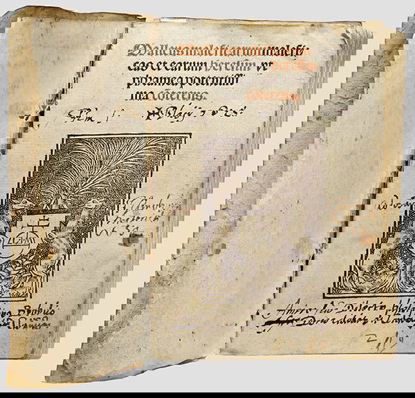
Figure 1 is the title page for Ariette, mise en musique (1756). It was designed by Pierre Simon Fournier le Jeune and is an excellent example of rococo in print. It uses a dizzying and fussy array of geometric, floral, and curvilinear ornaments to frame the text (Meggs & Purvis, 2016, p. 130).


Figure 1. Title page from Pierre Simon Fournier le Jeune’s Ariette. From Meggs & Purvis (2016, p. 130).

While Rococo drew upon classical traditions, it did not draw upon them so heavily as did neoclassicism. Neoclassicism celebrated the clean-lined aesthetics of Roman and Greek antiquity. Illustrators in this tradition sought to “imitate nature in her most perfect form” (Meggs & Purvis, 2016, p. 141). Engravings demonstrated a sharp contrast of value, and engravers strove for a perfection of technique.

During the Napoleonic era, Pierre Didot created a book series called Éditions du Louvre. Figure 2 shows a double-page spread from Voltaire’s 1798 La Pucelle d’Orleans, one of the books in the series. The lavish margins and precise and mechanical typography of this spread exemplify the perfection sought after in neoclassicism (Meggs & Purvis, 2016, pp. 141, 143).


Figure 2. Double-page spread from Voltaire’s La Pucelle d’Orleans. From Meggs & Purvis (2016, p. 143).

Romanticism came about as a response to Neoclassicism. Although it did not remove all references to antiquity, it placed much more emphasis upon personal emotions and imagination than it did upon the natural world. Perfection of form, achieved through drafting tools, was eschewed for more organic shapes. Bright colours replaced the monochromatic pages of Neoclassical literature.

William Blake was a harbinger of the Romantic era. This visionary poet and artist published books of his poetry using relief etchings without using typography. He integrated his letterforms into his illustrations, and his pages were hand-coloured by himself and his wife.


Figure 3. Title page from William Blake’s The Book of Thel. From Meggs & Purvis (2016, p. 145).

Question:
Whereas neo-classicism obviously hearkened back to the ancient world, do you think William Blake, with his hand-lettering and hand-coloured covers, was hearkening back to medieval illuminated texts?

References

Meggs, P. & Purvis, A. (2016). History of Graphic Design (6th Edition). Hoboken, USA: John Wiley & Sons, Inc.

Rocaille. (2017). In Reverso Dictionary. Retrieved February 18, 2018 from http://dictionary.reverso.net/french-english/rocaille

What Are Some Characteristics of Rococo Art? (2018). From Reference.com. Retrieved February 18, 2018 from https://www.reference.com/art-literature/characteristics-rococo-art-69eab49bb47f192#
shantell: Foreshortened raven staring at viewer with head cocked to the side (Default)
My next photography assignment is to do reflective photography. I found what looks like a good tutorial at Photographing Highly-Reflective Products: How to Control Reflections.

Here's a visual excerpt:

reflection lighting effects

I also found a tutorial on how to use light painting with reflective surfaces, so this appeals to me. How To Take Psychedelic Photos of CDs

Here's one of the CDs photographed using light painting.

light painted cd


Here are some other examples of reflective photography that I found interesting.


shantell: Foreshortened raven staring at viewer with head cocked to the side (Default)
One of the initial designs I worked on for my logo was the octopus mountain monogram idea. I went through a lot of experimentation with this idea, and also learned more about how to use Adobe Illustrator while I was at it.

Although I ultimately did not choose this idea, the process was educational.

I played around with rough design.

Octomountain

And then I experimented with colour:

colour experimentation

When I took it into Illustrator, my first attempts were awful.

Illustrator design 1

But it did get better. For the curved part, instead of just using the shapes or pen tools, I used typography. I grabbed a letter S, turned it into a shape, and modified it.

Illustrator design 2
shantell: Foreshortened raven staring at viewer with head cocked to the side (Default)
Creating my thumbnails forced me to think further about my logo ideas. I went from full-on monograms to much more abstract designs. My idea changed from octopus to mountains to monograms to variations on the Egyptian fly. I ultimately went with the fly design for a few reasons:

1. It was something I could more easily recreate with my nascent Adobe Illustrator skills.
2. It's loosely based upon a design I created for a tattoo I got.
3. It abstractly incorporates the monogram for SM.
4. It is based off the concept of the Egyptian fly, whose symbolism is meaningful to me.

When I studied jewellery design and jewellery history, I learned about the symbolism of the Egyptian fly.

Necklace from tomb of Queen Ahhotep I

The fly amulet was a military honour bestowed upon those who persevered in the face of adversity. Think about a fly. They never give up. They will keep buzzing around your face no matter how much you bat at them. They are a potent symbol of tenacity, and this is a symbol I found inspiring.

I am not Egyptian, so I chose a species of fly indigenous to where I live: the common greenbottle fly. This species of fly may be found all over the world.
bottle fly

The original concept sketch for my tattoo looks like this:

Tattoo design

The tattoo artist (Cam at Berlin Tattoos) simplified the design to this:

tattoo

I played around with the design some more with the thought of turning it into a logo. The swoop of the wings create an abstract M. Viewed from the side, they also produce an abstract S. And the mouth parts of the fly are a much more direct M.

Here's my initial thumbnail sketch:

Thumbnail sketch

I took it into Adobe Illustrator and worked with shapes, type, and the pen tool. The colours became even more simplified: Chartreuse, mid-toned green, and black. Chartreuse, black, and green are the distinguishing colours of the common greenbottle fly, depending on light refraction. I chose a transparent background so that it could be used digitally on a variety of backgrounds.

I ended up with this:

ShanMonster logo

Then, to see what it looked like in a physical application, I used Photoshop to place it upon an article of clothing.

Bikini bottom

I also rendered the design using traditional media: black and grey ink on paper.

Hand-rendered design

When my software skills are stronger, I'd like to revisit this and improve upon it.
shantell: Foreshortened raven staring at viewer with head cocked to the side (Default)
Light Painting:


Here's a demonstration of how he made the light-painted skeletons.


This light-painted stop motion animation has less focus on the light and more upon what it illuminates.


Ctenophora (Stop Motion Light Painting) from Alex McLaren on Vimeo.


I also love the work being done by Amanda Palmer (and Edward KaSpel).


And I can't talk about stop motion animation without referencing Ray Harryhausen, of course!


And here's a first-person view of diving, which might translate well into stop motion animation.
shantell: Foreshortened raven staring at viewer with head cocked to the side (Default)
I'm looking into representations of owls in stop motion animation and have discovered ookpik stop motion animation movies at Sealskin Stop Motion: Co Hoedeman’s Inuit Legends.

In addition, I found a strange blurb about how the ookpik almost became the national symbol of Canada, rather than the beaver. Ookpik, Little Ookpik but no Song....


I'd like to try making my own impressions of a snowy owl. Here is what one sounds like:

shantell: Foreshortened raven staring at viewer with head cocked to the side (Default)
My next major project has been announced, and I already have ideas on what I want to do.

I was inspired a couple of weeks ago by this video of a snowy owl chilling out on a frozen lake:


I want to do something based upon this idea. I'm tentatively calling it "Ookpik," and would like to have throat singing as background sound, mixed in with the sounds of wind and water. I'd like to incorporate elements of old-timey puppet show/operetta effects. Something along this line:

wave props

But instead of water, I'm thinking of doing water-colour painted blocks of ice, which will be moved up and down.

I'm looking into whether there are owl songs in tradition Inuit throat singing.
shantell: Foreshortened raven staring at viewer with head cocked to the side (Default)
Originally, I'd planned on drawing all of my bats in flight, but after studying each of the species, I decided that focusing upon their faces would be the best idea. The species are most readily distinguished from one another by looking at their faces. From a distance, they look more similar. Also, when I showed my thumbnails to other people in person, the portraits elicited more powerful reaction. People are cuted-out by the faces.

Since part of the reason I chose bats is because they're in trouble because of disease and habitat loss, it makes sense that I should endeavour to make them more appealing to the masses. And so I intend on emphasizing their cute side. People are more likely to want to save things they find cute than things which look gross, no matter how important those gross-looking creatures may be.

So, less this:

Scary bat

And more this:

Big Brown Bat

Here are my thumbnail sketches:

Thumbnails

Thumbnails

Thumbnails

From this, I created six linear sketches.

Silver-haired bat
Silver-Haired Bat

Big Brown Bat
Big Brown Bat

Long-Eared Myotis
Long-Eared Myotis

Little Brown Bat
Little Brown Bat

Red Bat
Red Bat

Hoary Bat
Hoary Bat

Although I'd love to do scientific illustrations for each of these bats, I do not have the time, so instead I plan on doing soft pastel drawings. I want to do the drawings on black paper to make the colours pop, and also to demonstrate the nocturnal nature of the animals.

Here is a colour test of soft pastels on black paper in some of the colours I'll be using.

Pastel colour test

As for the hand-lettering, I plan on using pencil crayon, since pastels are too smudgy.

The stamp booklet will be simple. The background design will be minimal, so as not to detract from the bats. I'm thinking of maybe having a moonlit backdrop.
shantell: Foreshortened raven staring at viewer with head cocked to the side (Default)
My next unit in photography class is based upon product photography, so I went searching for tutorials and some images I find interesting.

product photography

Several useful-looking tutorials are available at Sale as Seen: 44 Tutorials on How to Shoot Perfect Product Photos for Your Online Shop, so I'll be checking these out in greater depth.

Light cube

When I was a student at the New Brunswick College of Craft and Design some fifteen years ago, I did a brief unit on photographing jewellery, but I don't remember a whole lot about it other than it was ridiculously difficult to photograph highly-polished silver. I used some sort of little light cube. And before that, I'd been hired by a jewellery shop to inventory all their merchandise for an online store. There was a light box there, but ironically enough, the highest-quality photos came from me scanning the jewellery with a Kleenex background.

Another idea is to go with light painting, a technique I adore. A tutorial for light-painted product photography is available at Using Light Painting (Lighting Brush) Technique in Product Photography.

This product photo was done with light painting.

light painting
shantell: Foreshortened raven staring at viewer with head cocked to the side (Default)
The advent of the typographic book had enormous repercussions upon the world. It did not take long for the effects to radiate outward from Gutenberg’s presses in Germany. With books dropping significantly in price and increasing drastically in number, illiteracy began to decline. With that decline came a unification and stabilization of languages: a kind of reverse Tower of Babel effect. When people of a nation were suddenly able to communicate with one another through print, it contributed to nationalism and “the development of the modern nation-state” (Meggs & Purvis, 2016, p. 85).

The most popular book of the time was the Bible, the first book committed to Gutenberg’s presses. Edition after edition was printed, putting the Bible in the hand of the common folk. This resulted in people coming up with their own interpretations of the Bible, something which shattered Christianity into hundreds of sects (Meggs & Purvis, 2016, p. 87). Unfortunately, it also acted like gasoline thrown onto the fires of the Spanish Inquisition, which was sworn to fight heretical viewpoints. It was a time of intense religious xenophobia (New World Encyclopedia, 2014, para. 3).

The second-most popular book of the time was a book called the Malleus Maleficarum or Der Hexenhammer in German (“Hammer of Witches”), written by Dominican Inquisitors Heinrich Kramer and Jacob Sprenger. It is unfortunate timing that this book was written so closely after the invention of the printing press. It became a bestseller. With its wide release, the hate-filled misogynistic views of the two Inquisitors spread rapidly across Europe. It became the main handbook for witch hunters between the years of 1486-1600 (Encyclopedia Britannica, 2010, para. 3), resulting in uncountable torturings and excruciating deaths. The influence of the book even made it to the United States years later, informing the views of the Puritans in Salem, Massachusetts, resulting in even more violent deaths.


Malleus Maleficarum

Figure 1. Frontispiece from 1519 edition of Malleus Maleficarum. From LiveAuctioneers (2018).

References


Encyclopedia Britannica. (2010). Malleus Maleficarum. Retrieved February 4, 2018, from https://www.britannica.com/topic/Malleus-maleficarum

N/A (2018). 222: A malleus maleficarum maleficas et earum heresim u. LiveAuctioneers. Retrieved February 4, 2018 from https://www.liveauctioneers.com/item/1299361_222-a-malleus-maleficarum-maleficas-et-earum-heresim-u

Meggs, P. & Purvis, A. (2016). History of Graphic Design (6th Edition). Hoboken, USA: John Wiley & Sons, Inc.

New World Encyclopedia (2014). Malleus Maleficarum. Retrieved February 4, 2018, from http://www.newworldencyclopedia.org/entry/Malleus_Maleficarum


Question

Gutenberg printed from Mainz, and Nuremberg became a major printing centre. Both of these regions were also hot spots for the witch craze during this same period. Do you think this is coincidental? If not, how did one affect the other?

Profile

shantell: Foreshortened raven staring at viewer with head cocked to the side (Default)
Shantell Powell

April 2018

S M T W T F S
1 234 567
8910 11 121314
15161718192021
22232425262728
2930     

Syndicate

RSS Atom

Most Popular Tags

Style Credit

Expand Cut Tags

No cut tags
Page generated Jul. 4th, 2025 06:19 pm
Powered by Dreamwidth Studios