shantell: Foreshortened raven staring at viewer with head cocked to the side (Default)
Axial Layouts
Exercise 1: Axial System: Examples.

Exercise 2: Radial Systems: Examples
Nikola Tesla typography poster: Radial posters

Dilatational Systems: Examples


History:

Apollinaire’s Calligrammes (1918): "A book of poetry by French writer Guillaume Apollinaire, noted for its use of “caligrams” in which typeface and arrangement of words on the page add to the meaning of the compositions. In this way, the collection can be seen as a contribution to the tradition of concrete or visual poetry. Considered as the forefather of Surrealism, Apollinaire described his work as follows:"

"The Calligrammes are an idealisation of free verse poetry and typographical precision in an era when typography is reaching a brilliant end to its career, at the dawn of the new means of reproduction that are the cinema and the phonograph. (Guillaume Apollinaire, in a letter to André Billy)"

The Modernist Era: Concrete poetry: "The term was coined in the 1950s. In 1956 an international exhibition of concrete poetry was shown in São Paulo, Brazil, by the group Noigandres (Augusto and Haroldo de Campos, Décio Pignatari and Ronaldo Azeredo) with the poets Ferreira Gullar and Wlademir Dias Pino. Two years later, a Brazilian concrete poetry manifesto was published."
shantell: Foreshortened raven staring at viewer with head cocked to the side (Default)
One of the initial designs I worked on for my logo was the octopus mountain monogram idea. I went through a lot of experimentation with this idea, and also learned more about how to use Adobe Illustrator while I was at it.

Although I ultimately did not choose this idea, the process was educational.

I played around with rough design.

Octomountain

And then I experimented with colour:

colour experimentation

When I took it into Illustrator, my first attempts were awful.

Illustrator design 1

But it did get better. For the curved part, instead of just using the shapes or pen tools, I used typography. I grabbed a letter S, turned it into a shape, and modified it.

Illustrator design 2
shantell: Foreshortened raven staring at viewer with head cocked to the side (Default)
Broadway and Thorne’s Fat Face are typefaces with a long and illustrious history. Thorne’s Fat Face is the older of the two typefaces, dating back to the dawn of the nineteenth century. Its creator, Robert Thorne, was a pioneer of typography and a prominent type founder. With the advent of readily-available printing technology, there was a huge rush in print advertising. Thorne’s business was thriving under this demand, and he developed this extra-bold typeface, which was described as “fat”, in 1803.

Thorne’s Fat Face was a sensation. It was sought after by advertisers because its engorged letterforms paired with hair-thin serifs and connecting strokes made it dominate a page (Kennard, 2014, para. 1). It was well-suited for ornamentation because of its thick letters, as can be seen in this reward poster for a missing horse.

lost horse

Although it was much sought-after by advertisers, critics were aghast. One referred to it as having “preposterous disproportions” (de Jong et al, 2017, p. 108) Despite the criticisms, it was a successful typeface, and ended up having a significant effect on how text was used in advertising.

Before the advent of fat typefaces, advertisements were wordy, with long narratives. Since there was no room for many words on a poster dominated by Thorne’s Fat Face, advertising evolved to use fewer words, and to be punchier and more concise (de Jong et al, 2017, p. 109).

Compare the verbosity of the preceding poster with this poster from the 17th century:

Wall of text advertisement

Thorne’s Fat Face made advertising quickly readable without anyone needing to squint.

The next typeface to be compared, Broadway, was and is used for other purposes altogether. Superficially, they seem quite different. Thorne’s Fat Face is turgid and bloated, especially paired with its miniscule serifs. However, Broadway is not entirely dissimilar despite its more elegant appearance. It also relies on the pairing of thick strokes with thin ones, but to a different effect.

Broadway was designed in 1927 by Morris Fuller Benton. Originally, it was created with only uppercase letterforms, but lowercase letterforms were developed in 1929 by Sol Hess (P22 Type Foundry, 2018, para. 1). Unlike Thorne’s Fat Face, Broadway is a decorative sans serif typeface, and where Fat Face evokes a feeling of snake oil salesmen and wanted posters, Broadway is the textual embodiment of the Roaring Twenties. It is the quintessential Art Deco typeface, as can be seen in this poster:

Art Deco

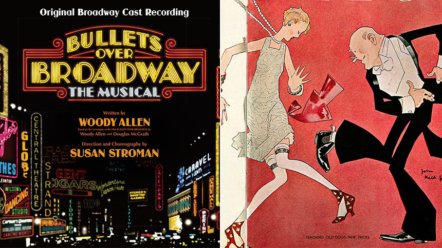
It was also used for its namesake as evinced by this original cast recording for the production of Bullets Over Broadway:

Bullets over Broadway

The Broadway typeface contains no descenders in its lowercase letterforms which makes it ideal for bold underlining. Its angular tangents between thick and thin also give it high contrast, making it ideal for colourful compositions (Microsoft, 2018, para. 1).

Both typefaces have a distinct appearance, and both effectively take viewers back to the times in which the letterforms were created.


And here is my study of the two typefaces, hand-drawn on fondant-covered cookies.

Eat my words

References


De Jong, C., Purvis, A., & Tholenaar, J. (Eds.) (2017). Type: A Visual History of Typefaces & Graphic Styles. Cologne, Germany: Taschen.

Kennard, J. (2014, February 6). The Story of Our Friend, the Fat Face [Blog post]. Retrieved January 24, 2018 from https://fontsinuse.com/uses/5578/the-story-of-our-friend-the-fat-face

Microsoft (2018). Microsoft Typography: Broadway. Retrieved January 24, 2018 from https://www.microsoft.com/typography/fonts/family.aspx?FID=86

P22 Type Foundry (2018). Broadway. Retrieved January 24, 2018 from https://p22.com/family-Broadway
shantell: Foreshortened raven staring at viewer with head cocked to the side (Default)
The Story of Our Friend, the Fat Face
Robert Thorne's Fat Face


Wall of text advertisement


Broadway™
Broadway: Microsoft Typography: "First released in 1929, Broadway exudes the atmosphere of the Roaring Twenties. Thick black strokes on the left half of characters such as the 'B' and 'O' make the letterforms abstract and ornamental. Where thick and thin strokes meet, the letterforms feature angles rather than curves, similar to the way Art Deco treats natural forms. Broadway is ideal for the design of decorative posters and display material. With no descenders in the lowercase letterforms, Broadway accepts bold underlining without the usual trouble of disappearing descenders. In addition, due to its high contrast, Broadway remains visible on backgrounds of similar density, making it ideal for colorful work. For example, green lettering on a blue background would be difficult to read if the font were Arial, but the same colors would be easier to read with the text in Broadway."

FONT DESIGNER – MORRIS FULLER BENTON

Bullets over Broadway

Art Deco
shantell: Foreshortened raven staring at viewer with head cocked to the side (Default)
Skinfolk is a book for people curious about Inuit mythology. The book pairs objects from Inuit life with traditional stories. Inuit mythology demonstrates the transformative nature of living beings and also shows how allegedly inanimate objects contain life. This animistic nature is illustrated by the pairings of myth and object within the book. The word “skinfolk” is a portmanteau tying together the ideas of kin, skin, and folklore, and the book’s four tales have a central theme of how powerful women interact with flesh.

In order to ensure the topic is treated respectfully, an Inuk elder was consulted at the onset of the book’s creation. She also provided assistance in using consistent dialects for the Inuktitut terminology. An Anishinaabe craftsperson was consulted in order to learn traditional beadwork techniques, giving authenticity to the hand-beaded cover.

The colour palette is a simple one of white, blue, black, and red: common colours for traditional Inuit beadwork. The beadwork is sewn directly into the leather, foreshadowing the central theme of interactions with flesh. The single red bead in the tittle of the letter “i” and the red binding thread slashing across the margins represent the blood from those interactions. The cool silvery cast of charcoal illustrations and black-and-white photography matches the northern climes from whence spring the tales.

The typeface used for the title is Arjowiggins Inuit, chosen because it marries elements of Inuktitut syllabics with Latinate letters. Gadugi, the sans-serif font chosen for the text within the book, offers a seamless transition between English and Inuktitut.
shantell: Foreshortened raven staring at viewer with head cocked to the side (Default)
As my idea evolved, I decided to look into Inuit mythology for further inspiration. I've long been interested in folklore, mythology, and story-telling in general. It's a huge reason why I double-majored in English and Classics: for the stories! A few years ago, I wrote a play based upon Inuit mythology, and while researching for it, I realized a few the stories were strangely familiar. The more I read, the more I realized I'd known some of those tales since I was a small child. My father had told me some of them, but my recollection had grown fuzzy over the decades.

As I read through the stories and through folklorist's interpretations, I winnowed my stories down to four. Because of prior brainstorming, I wanted stories which dealt with interactions with the flesh. These four stories accomplish this. They also each incorporate women of strong magical ability.

I played with various ideas for a title, polling my peers online for suggestions. Some of the ideas were decent, but none quite clicked for me. And then I decided upon Skinfolk, since it ties in several elements:

  • A play on words of "kinfolk," since the Inuit are my kin, and the characters within the stories (with one exception: the Spider Woman) are all kin to one another
  • Skin is a tie-in to the theme of interactions with flesh
  • The folk part references folklore, and these stories are part of Inuit folklore


Having the title interact with skin via embroidery is yet another tie-in.

After choosing the stories, I spoke with Inuk elder Tauni Sheldon. I pitched my book idea to her. We spoke at length about my intentions with the stories and about my understanding of the stories and the lessons they offered. She wasn't familiar with the story of Kiviuq and the spider woman, so I told her about the book I'd found the most information in: Kiviuq: An Inuit Hero and His Siberian Cousins by Kira Van Deusen.

She also gave me a crash course in Inuktitut syllabics. This is the syllabic guide she shared with me.


She also made me realize that although I love the Arjowiggins Inuit typeface, it is detrimental to use it within the book when paired with Inuktitut syllabics. When I shared an image of my name hand rendered in this typeface, she was confused by it. She was trying to read it in Inuktitut rather than English. To remove the confusion, I kept the typeface for just the title, where it is not contextually confusing.

[Name in Arjowiggins Inuit]
shantell: Foreshortened raven staring at viewer with head cocked to the side (Default)
Part of the project involves a hand-lettered book cover. I knew I wanted to do something with the Arjowiggins Inuit typeface, but as a bespoke typeface, it is not commercially available. I wrote to Arjowiggins Creative Papers, and they were nice enough to share it with me for my project.

At first, I was planning on replicating the typeface with tech pen, but while talking to folks at the Aboriginal Services Centre at Conestoga College, I saw Christina Restoule doing traditional indigenous beadwork. I asked Tauni Sheldon, an Inuk elder, if the beadwork was also used by Inuit, and she said that yes, it is a common element used on parkas and such. And so I decided I wanted to do my lettering in traditional beadwork.

Ms. Restoule told me she'd get me started with the technique, and on Friday, December 15, she helped me find the right sized beads and some leather to work with. I used an actual-sized printout of the title as a template.

The process is time-consuming. I worked on the beading all afternoon and into the late evening on Friday, throughout the day on Saturday and Sunday, then picked the template out painstakingly on Monday before adding the final accent red bead in the tittle.

I chose black leather to contrast with white and sparkly blue glass beads. The single red bead represents blood.

beginning lettering

adding blue borders

beading completed
shantell: Foreshortened raven staring at viewer with head cocked to the side (Default)
The idea continues to evolve. I'm no longer considering a cookbook, but instead, a book on Inuit culture and visceral folklore which will use photos demonstrating interactions with flesh.

One tentative story is of Blubber Boy.


(This video parodies Nanook of the North.)

Blubber Boy read aloud.

I managed to track down the creator of the Arjowiggins Inuit typeface, and he graciously sent me the font to use for my project.

shantell: Foreshortened raven staring at viewer with head cocked to the side (Default)
What happens when the upper-case letter L is investigated as an abstract design element? “A Study of L” investigates this idea in a minimalistic fashion. A grotesque sans serif L, with stem equal in length to the arm, is depicted in each rendering.

Every L is rendered in black ink on white paper. A grey line intersects the arm and stem on all but one L, with a single dot punctuating each. The result of these combinations is both geometric and evocative of petroglyphs and Inuit typefaces, with their angles and curves.

The top leftmost rendering sets the stage for the study. This L is tilted so that it resembles a bow, with the dot representing a projectile. This motif ties in with the petroglyph/Inuit typeface concept and traditional hunter/gatherer iconography while simultaneously incorporating simplified geometric elements of trajectory.

From there onward, each rendering demonstrates inclination angles, slant ranges, and horizontal distances from a variety of positions. The final L in the series creates an emphatic finale. Like the first rendering, the arm and stem are at forty-five degrees to the frame. The grey line no longer touches the L. Three grey lines show movement away from the dot. They do not touch the L, as there no longer is a trajectory: the red dot is a bullseye, and the bow’s projectile has met its target.

 photo IMG_E9593.jpg
shantell: Foreshortened raven staring at viewer with head cocked to the side (Default)
I am to research an art period/movement and implement it in a large design project. At first, I thought I'd do my project on surrealism, but then I thought it might be interesting to do it on an art style which isn't typically approached for this sort of project. I considered Inuit art and naive art, but unfortunately had to discard them as typography and/or photography wasn't sufficiently represented in these styles. And so I've come back to surrealism, which has a rich history with many colourful characters encompassing all sorts of design media.

Aside from research online, I've visited several libraries and spoke to librarians. I was introduced to the database system used by the Kitchener Public Library system, and found out I should be able to qualify for a community library card at Wilfrid Laurier University, thus giving me access to university libraries (and interlibrary loans).

I also went to the AGO twice to study the surrealist works at the Guillermo del Toro exhibit. I did several drawings of works there and took many photographs, including close-ups of various details.

Research resources:
The History of Visual Communication: The New York school included surrealists.
A Dictionary of Surrealism and the Graphic Image
Manifesto of Surrealism, by André Breton
Japanese surrealism
List of surrealist artists
Surrealist Artists: List of Painters, Sculptors, Photographers Associated with Surrealism.
Surrealism and the Occult
Drawing Surrealism
Decalcomania
SPECIAL SECTION ON NATIVE AMERICAN SURREALISMS, GUEST EDITED BY W. JACKSON RUSHING III


Typographers and Typography:
Normality Tinged With Perversion: David Lynch's Use of Typography
Isidore Isou - founded Lettrism
Diter Rot - Diter Rot Copley Book, Letterpress text
Elaine Lustig Cohen
Roman Cieslewicz: Typographer for The Mysteries of France:
A Gothic Guidebook
. A copy of the book is at the Kingston Queens University Library.
Eugen Gomringer
Oyvind Fahlstrom
Zdanevich
The Visible Word: Experimental Typography and Modern Art, 1909-1923 By Johanna Drucker
Salvador Dali made a few letters for his Paule Gala alphabet. More at Erotype.
The Art of Graphic Design: Lustig, Albers, Johnson, and the 1945 Summer Session by Julie J. Thomson
Edward Fella: Letters on America
Joop H. Moesman: Petronius
Typophile forum
The Man Who Married Text and Art: Isidore Goldstein and Lettrism


Colour Theory:

Josef Albers and Colour

Artists:

H R Giger Illustrations: includes early works from the 60s and 70s
Kansuke Yamamoto
Alejandro Jodorowsky
Jopie of Joop
Jindřich Heisler: Surrealism under Pressure
Wilfredo Lam: Cuba's last of the true surrealists

Techniques:

Decalcomania tutorial
Accordion book tutorial
Cubomania: Gherasim Luca and Non-Oedipal Collage by Krzysztof Fijalkowski at Norwich University of the Arts
Surrealist techniques

Profile

shantell: Foreshortened raven staring at viewer with head cocked to the side (Default)
Shantell Powell

April 2018

S M T W T F S
1 234 567
8910 11 121314
15161718192021
22232425262728
2930     

Syndicate

RSS Atom

Most Popular Tags

Style Credit

Expand Cut Tags

No cut tags
Page generated Jul. 6th, 2025 10:40 am
Powered by Dreamwidth Studios