The Story of Our Friend, the Fat FaceRobert Thorne's Fat Face Broadway™Broadway: Microsoft Typography
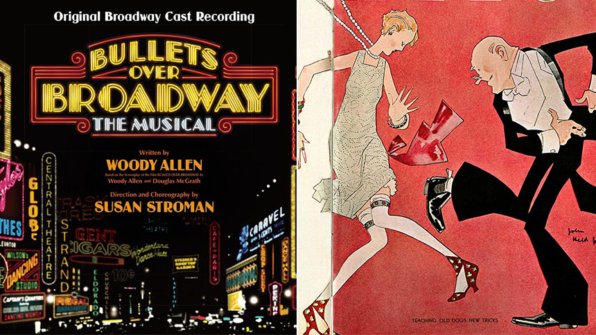
: "First released in 1929, Broadway exudes the atmosphere of the Roaring Twenties. Thick black strokes on the left half of characters such as the 'B' and 'O' make the letterforms abstract and ornamental. Where thick and thin strokes meet, the letterforms feature angles rather than curves, similar to the way Art Deco treats natural forms. Broadway is ideal for the design of decorative posters and display material. With no descenders in the lowercase letterforms, Broadway accepts bold underlining without the usual trouble of disappearing descenders. In addition, due to its high contrast, Broadway remains visible on backgrounds of similar density, making it ideal for colorful work. For example, green lettering on a blue background would be difficult to read if the font were Arial, but the same colors would be easier to read with the text in Broadway."
FONT DESIGNER – MORRIS FULLER BENTON


